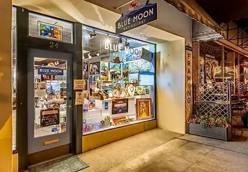
Studio-Grade Color Matching for Art Prints
Precision editing to ensure your reproductions match the tone, warmth, and feel of your original
COLOR YOU CAN COUNT ON
Faithful Reproduction With Gallery-Approved Accuracy
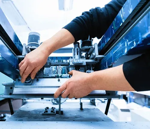
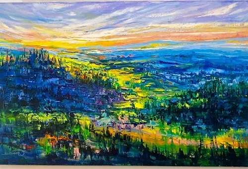
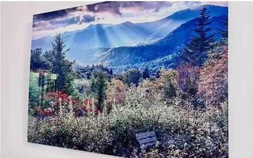
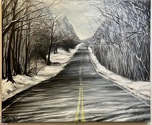
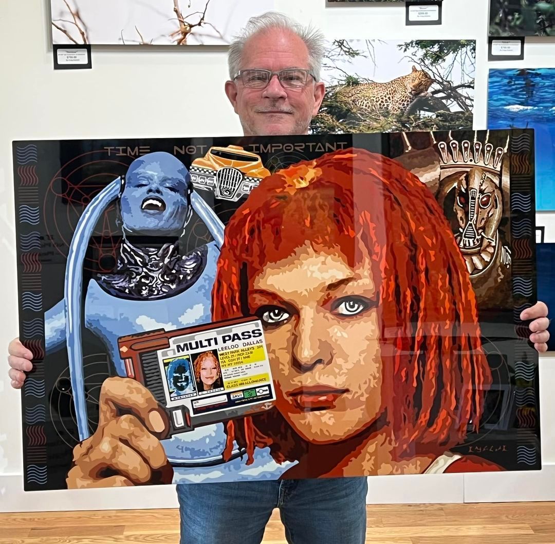
Color matching is one of the most critical steps in reproducing artwork. At Blue Moon, we take it seriously. Once we digitally capture your piece, we adjust hue, saturation, and contrast to match the original as closely as possible. Our calibrated monitors, controlled lighting, and pigment-based proofing process ensure you’ll never see color shifts that compromise your vision. Whether it’s a warm-toned watercolor or a bold acrylic, we dial in every detail so your print reflects your intent.
The Art of Matching
Visual Calibration With an Artist’s Eye
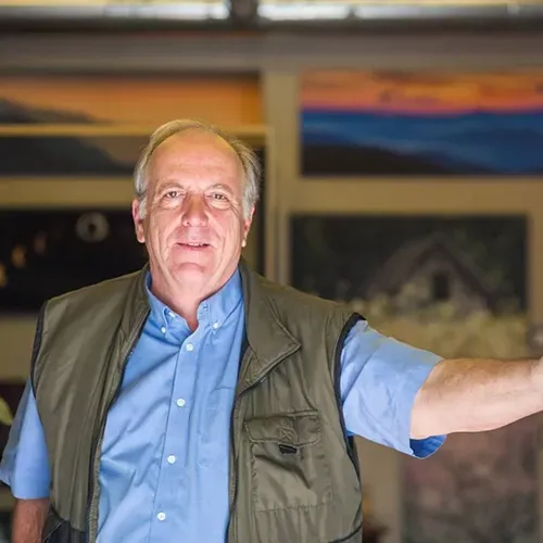
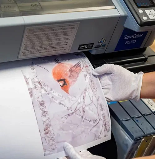
We don’t rely on automation to get it right. Each image is manually reviewed and corrected under daylight-balanced studio lighting. Founder and photographer Rob Travis brings a trained visual sensibility to the process, identifying subtle shifts and correcting them in real time. Our color-matching process is collaborative—you can review artist proofs and suggest changes until we achieve the result you want. This ensures confidence in every edition, especially when producing prints for sale or show.
WHY COLOR MATCHING MATTERS
Protect the Value and Integrity of Your Work
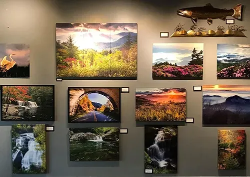
Accurate color isn’t just aesthetic—it’s essential for preserving the visual impact and emotional tone of your piece. Poor color matching can result in muddy tones, washed-out highlights, or overly saturated shadows. Our workflow maintains balance, luminosity, and texture, ensuring your digital reproductions carry the same presence as the original. Whether you're printing on canvas, paper, or metal, our process guarantees consistency and quality.
PROOF BEFORE YOU PRINT
Collaboration Through Every Stage
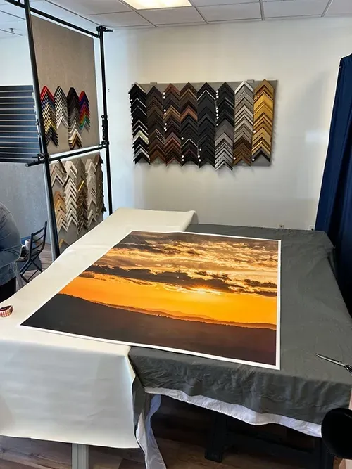
Before running full editions, we provide optional artist proofs so you can see exactly how your work translates to print. If adjustments are needed, we make them collaboratively—ensuring that each reproduction meets your standards and speaks with your voice. It’s this careful back-and-forth that sets Blue Moon apart. We’re not just technicians—we’re partners in presenting your art exactly how you intended it.
COLOR MATCHING FAQS
How We Match Tone, Hue, and Visual Feel
How accurate is your color matching?
Extremely accurate. We use calibrated equipment and proofing processes to replicate your original tones and hues.
Can I see a sample before printing a full run?
Yes. We offer artist proofs so you can confirm the match before committing to a full print edition.
Is color matching included with digital capture?
Yes. Every captured image undergoes our color-matching process before it’s used for prints or proofs.
What if the color still feels slightly off?
We’ll work with you until you’re satisfied. Adjustments can be made collaboratively based on your feedback.
Does the type of paper affect the color match?
Yes. Paper tone and texture can impact how colors appear. We account for this in our proofing and match accordingly.
ARTIST ENDORSEMENTS
Trusted Color Matching That Reflects the Original
Hear from collectors, designers, and art lovers who have experienced Blue Moon Metal Prints’ curated exhibitions and purchased original works for their homes and businesses.